Components
Components are considered as the carrier of a page in Agros apps. They control the lazy loading, fallbacks and other options that are not supported by the component.
A component must be consist of two parts:
- component description
- component declaration
Now we will learn what they are and how to define a component properly.
Component Description
Component descriptions are written in the same format as framework-specific components, for example, on Agros' React platform, component description files are written in JSX, and on the Vue platform, you can write component descriptions using the single-file component (known as SFC).
Here we write a User component description using the two frameworks above.
Component description with React:
import React from '@agros/platform-react/lib/react';

export default ({
    name,
    avatar: pictureUrl,
    email,
    motto,
}) => {
    return (
        <div className="user-card">
            <img className="avatar" src={pictureUrl} />
            <div className="info-wrapper">
                <h1>{name}</h1>
                <h2>{email}</h2>
                <h6>{motto}</h6>
            </div>
        </div>
    );
} as React.FC;
Component description with Vue SFC:
<template>
    <div class="user-card">
        <img class="avatar" :src="pictureUrl" />
        <div class="info-wrapper">
            <h1>{{name}}</h1>
            <h2>{{email}}</h2>
            <h6>{{motto}}</h6>
        </div>
    </div>
</template>

<script lang="ts">
export default {
    props: [
        'name',
        'email',
        'motto',
        'avatar',
    ],
}
</script>
In the subsequent documentation, we use React as our default platform, unless we encounter platform-specific content.
Component Declaration
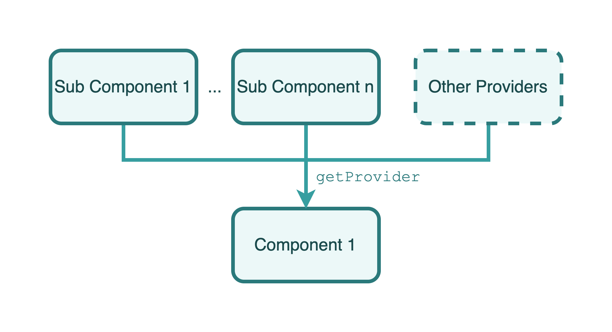
Component declaration is also a type of provider. Like normal providers, any provider (including component declaration) can be injected into a component declaration as a dependency, but a component declaration cannot be injected into other types of providers as a dependency.
Let's start by creating a simple UserComponent. This component declaration will use User.tsx as its description mentioned above:
import { Component } from '@agros/app';

@Component({
    file: './User',
})
export class UserComponent {}
To create a service using the CLI, simply execute the agros generate component user command.
Dependency Imports
Agros provides an option in its @Component() decorator called declarations, which is an array of provider classes that you can pass in to complete the imports of providers.
Now we extract a card for describing user's basic information, like avatar, name, email and motto because the card will be used by not only UserComponent, but other components. So we create a UserCard.tsx file:
import React from '@agros/platform-react/lib/react';

export default ({
    name,
    avatar: pictureUrl,
    email,
    motto,
}) => {
    return (
        <div className="user-card">
            <img className="avatar" src={pictureUrl} />
            <div className="info-wrapper">
                <h1>{name}</h1>
                <h2>{email}</h2>
                <h6>{motto}</h6>
            </div>
        </div>
    );
} as React.FC;
Then we should write a component declaration file to describe this component:
import { Component } from '@agros/app';

@Component({
    file: './UserCard',
})
export class UserCardComponent {}
We can now refactor our code in User.tsx and user.component.ts, import UserCard into User component:
import { Component } from '@agros/app';
import { UserCardComponent } from './user-card.component.ts';

@Component({
    file: './User',
    declarations: [
        // Add `UserCardComponent` into `declarations`
        UserCardComponent,
    ],
})
export class UserComponent {}
In the component description file, you can get the service through getContainer function:
import React from '@agros/platform-react/lib/react';
import { getContainer } from '@agros/app';
import UserCardComponent from './user-card.component';

export default (props) => {
    const container = getContainer();
    const UserCard = container.get<React.FC>(UserCardComponent);
    return (
        <div>
            <p>Information of current user:</p>
            <UserCard {...props} />
        </div>
    );
} as React.FC;
Other types of providers will also be able to be imported as the same way, see this for more information.
Lazy Loading
You can turn a component description into a dynamic component by setting lazy option in @Component() decorator to true. Agros provides fallbacks when lazy option in @Component() decorator is set to be true:
import { Component } from '@agros/app';

@Component({
    file: './User',
    lazy: true,
    suspenseFallback: <div>loading...</div>,
})
export class UserComponent {}
Here is a demo GIF of lazy loading:
Styles
Style files can be passed into the styles option of @Component() decorator. It's an array of string, which indicates the all style files' location. You can pass either absolute path or relative path (with the component declaration file) into it.
import { Component } from '@agros/app';

@Component({
    file: './User',
    styles: [
        './user.component.css',
    ],
})
export class UserComponent {}
Registration
After defining a component, we should declare it in the corresponding module file to register it:
import { Module } from '@agros/app';
import { UserComponent } from './user.component';

@Module({
    components: [
        UserComponent,
    ],
})
export class UserModule {}
The Agros CLI will automatically add these lines to corresponding module file when adding a new component using agros generate command.